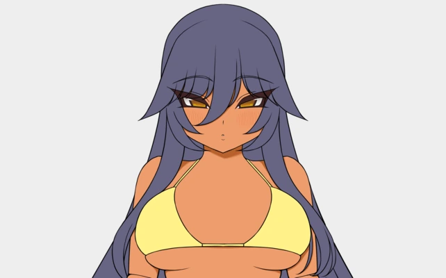
You’ve linearted your piece, you’ve laid down the base colors, and now you want to figure out how those colors change when they’re in shadow. What do you do?
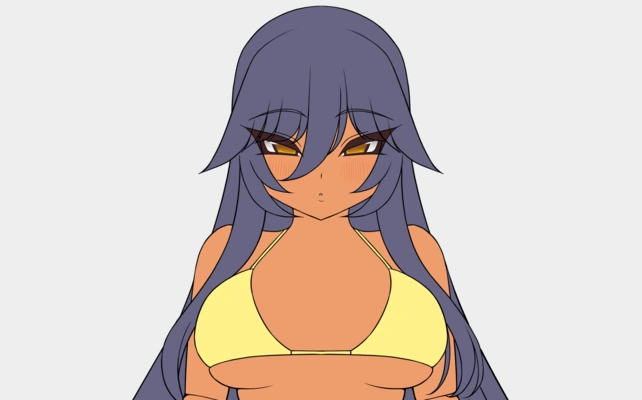
Most people’s first intuition is to just turn down the brightness of the color. We’ll use the skin color here as our example and lay down some cast shadows.

Sadly, if you’ve done this, you might have noticed that it doesn’t work very well. The shadow color will appear a bit washed out and unnatural, or have a sort of burned look. It’s not great. It’s not that this is the wrong thing to do, it’s that we’re missing a couple of extra steps.
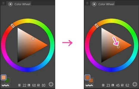
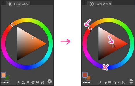
The next thing you need to do is tweak the saturation of the color. As colors get darker, they tend to get more saturated too. How much more saturated? Just a little is fine, usually. However, on surfaces that are more translucent, like skin, you want to push the saturation a little more. This has the effect of emulating subsurface scattering, the phenomenon of light penetrating the skin and bouncing around, making it look like it glows slightly.
We’re almost there!
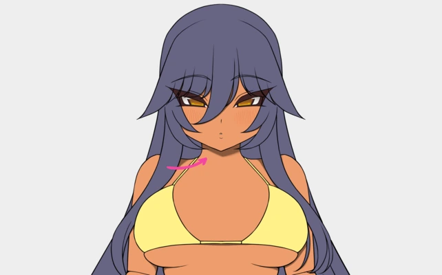
Finally, the last thing you need to do, and this is where the name of the technique comes from, is tweak the hue of the color. You see the color wheel? That’s what the hue is. We want to adjust it a little. But what kind of adjustment do we do? Here’s a rule of thumb: if you’re trying to make the color darker, you push the hue toward the deep blue. This is because as colors get away from the light they tend to get colder – makes sense, right? – and deep blue is the coldest hue.

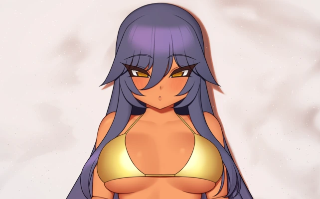
Now we’re talking! That looks like a much nicer color for the shadow. I encourage you to play around with how much you push each of these 3 things and see what you like best.
By the way, this works if you’re working with a color that’s on the other side of the color wheel too, like green. You just go toward the deep blue. It’s always the same.
And that’s it.
So to recap, to figure out how a color looks in shadow, you take the base color and make it a little darker, a little more saturated, and you push the hue a little toward the deep blue. And this works for just about any color and any material. Pretty cool, right?
But how do you make a color brighter?
We know how to make a color darker, but how would you do the opposite? Like, say you want to do a highlight on the skin. What happens when the color becomes even more bright than the base color?
Well, the brightness and saturation part is easy enough. Just invert the process by increasing the brightness and decreasing the saturation. But what about the hue? To make it darker we pushed it toward the deep blue, but for making it brighter what color do we push it toward? I don’t know what the widely accepted answer is here (most of the advice on this article is taken from my years of experimentation) but I have found that you want to push it toward the yellow. I have found that to be the brightest hue, and sure enough, the results seem to work well.
Edge case: What happens if a base color is yellow or deep blue?
Say for example your base color is deep blue. What do you do to figure out its shadow color? What direction to you move the hue? Do you just not move it, since it’s already there?
I haven’t found a great solution for this. I think the best solution is to just try to avoid it. Change the color from being deep blue to a color that’s close to deep blue, so you have room to shift it for the shadows.
But there’s another edge case here. If your base color is yellow, what direction do you go to figure out its shadow color? Do you go clockwise? Counter-clockwise? I have found that usually going toward the red works better for me, but that may be because I do very warm summer pieces. If you were doing a cold scene, you may want to go through the blue side. Worth experimenting!
Edge case: How do you handle greys?
More specifically, what do you do about the saturation? If you add saturation to a grey color then it’s no longer grey. Hmmm.
I think there’s two approaches here. For newer artists, I think the best thing to do is to just tweak the brightness and leave the hue and saturation alone. This will work fine.
For more advanced artists, you will want to influence the color of the grey with ambient light. If you use overlay layers for post processing, it can be as simple as letting those add some color to the grey. Of course, you can find more complex ways of doing ambient light, but this gets outside the scope of this tutorial, so I’ll leave it at that.
Final words
This is the kind of tutorial I wish I knew about 10 years ago. Resources on this kind of stuff are so hard to find. You google color theory and you get all sorts of super basic (and useless) articles about complimentary colors and such, but almost no nitty gritty stuff about lighting that you would actually use.
I ended up picking up bits of knowledge here and there and experimenting for years to figure out these problems. Hopefully this helps demystify this for others who are going through it.
And that’s it. If you have any questions or feedback, tell me about it!